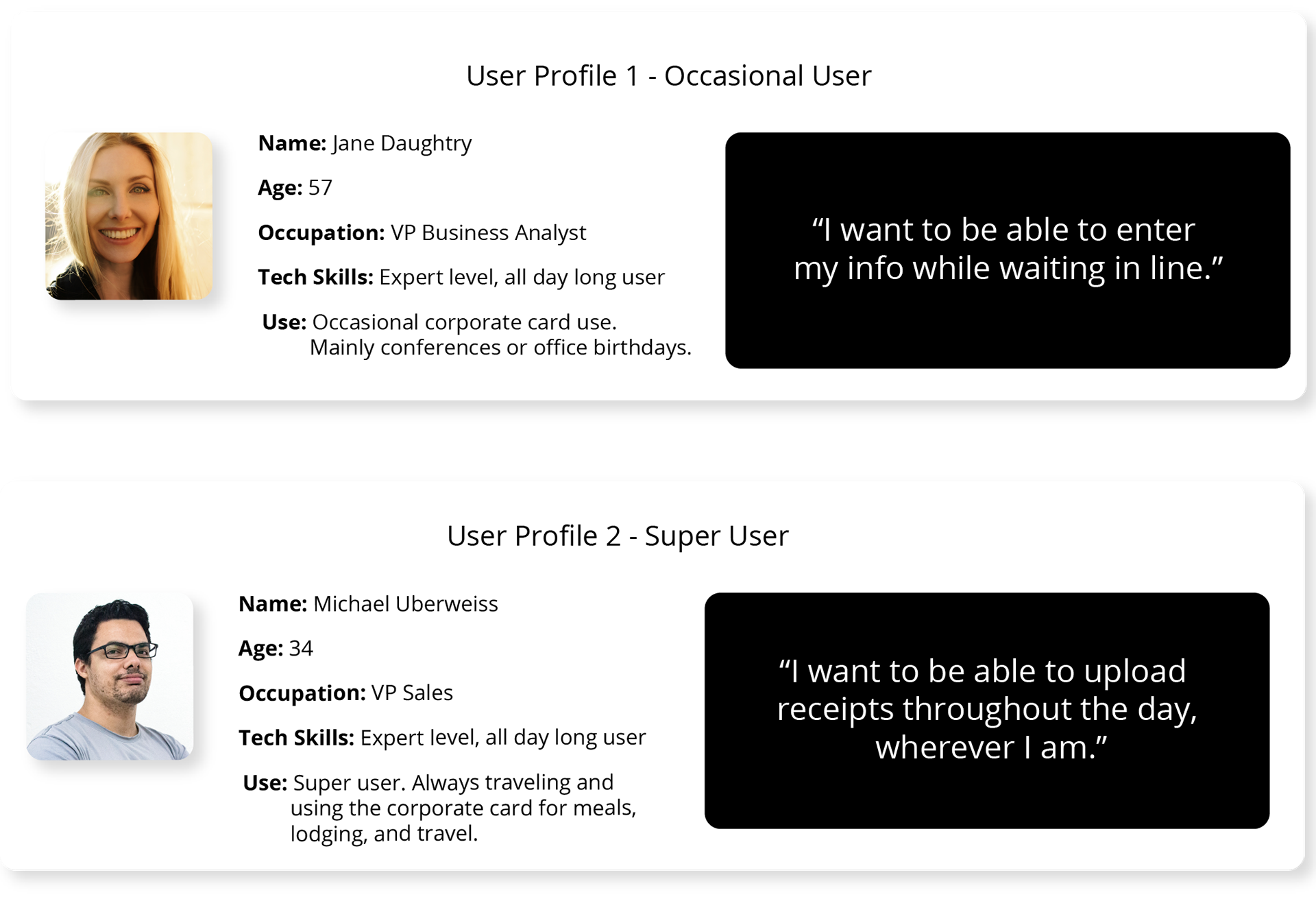
Users for this application fell into 2 categories: the occasional user and the super user. However, the groups had the same objective in mind and that was to upload receipts away while on the go.
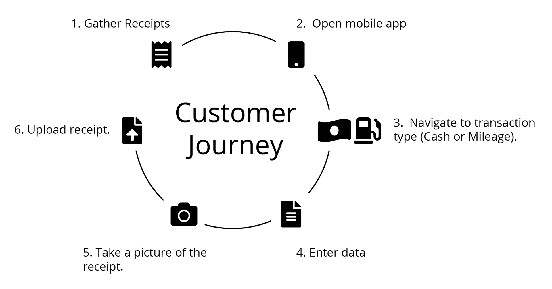
As you can see, there were basically six steps in the customer journey for a basic interaction. The journey expands slightly if a user wants to view their balance or pending transactions.

Basic site flow. Simple and fast-loading.
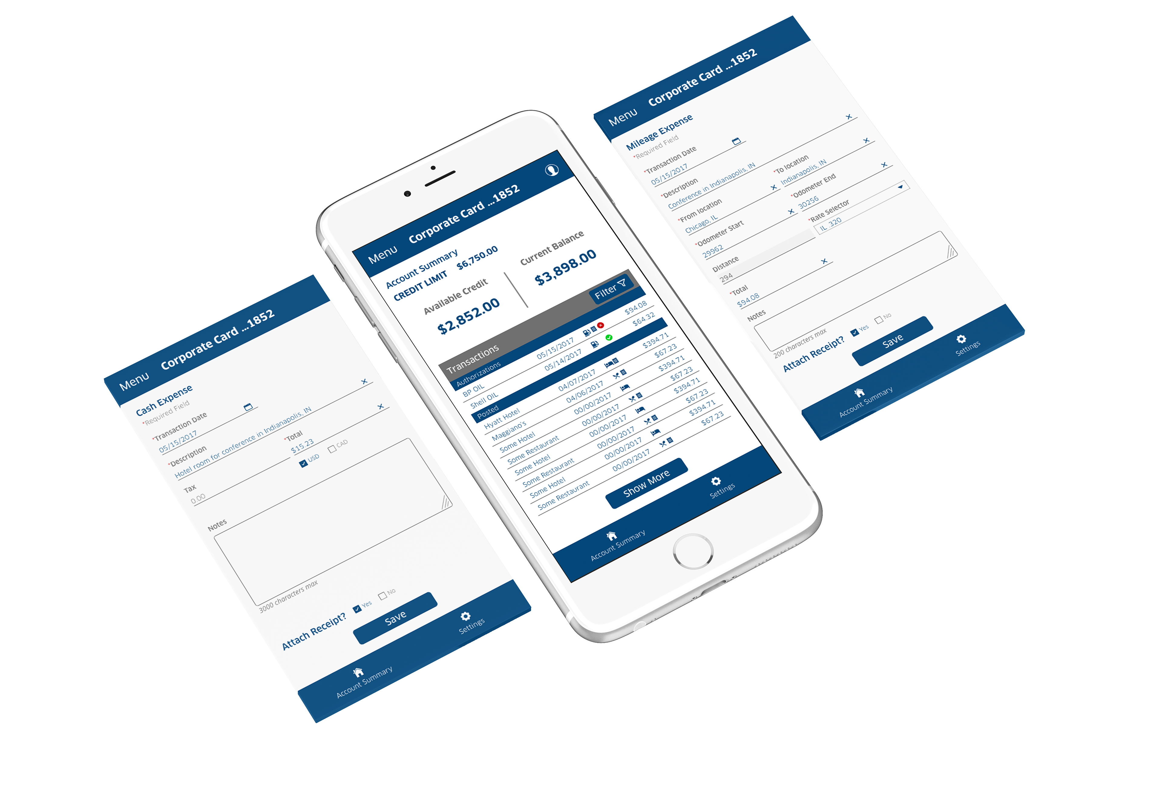
Here you see the final design for 3 of the screens and the style is in line with the desktop version of expense reporting. We came to this after all the back and forth with the product owners. Touchpoints are tightly grouped and everything was meant to exist on the screen with no scrolling. It is very clautrophobic.
Scroll down to see how I wanted the design to look.
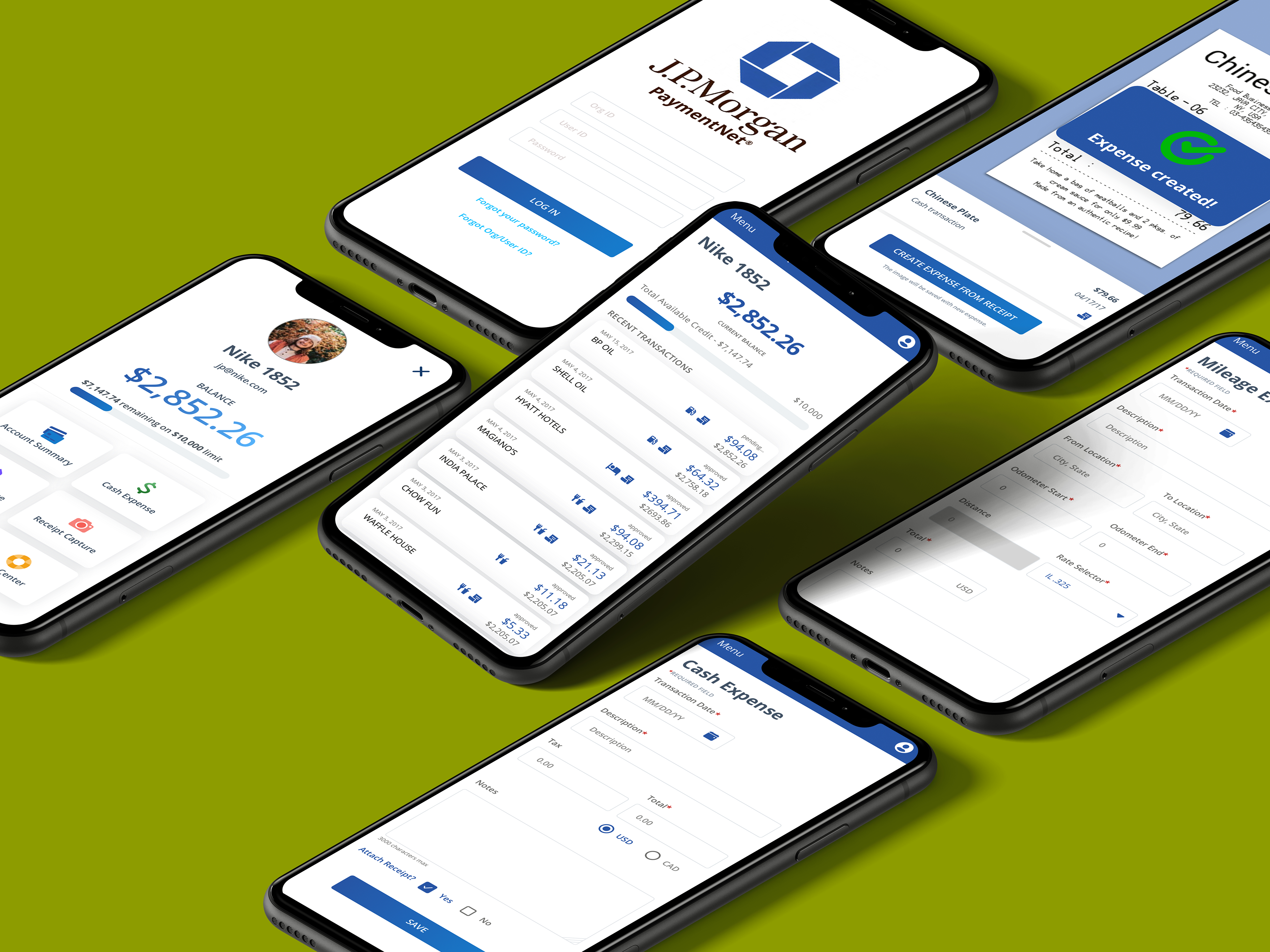
This is what I wanted the app to look like. I wanted to separate the design from the desktop version because that too needed a refresh. Here, text is more readable, there is more room for touchpoints, and more whitespace. All together I think things are easier to read and touch. Inputs are more clearly defined. There is no confusing hamburger menu.